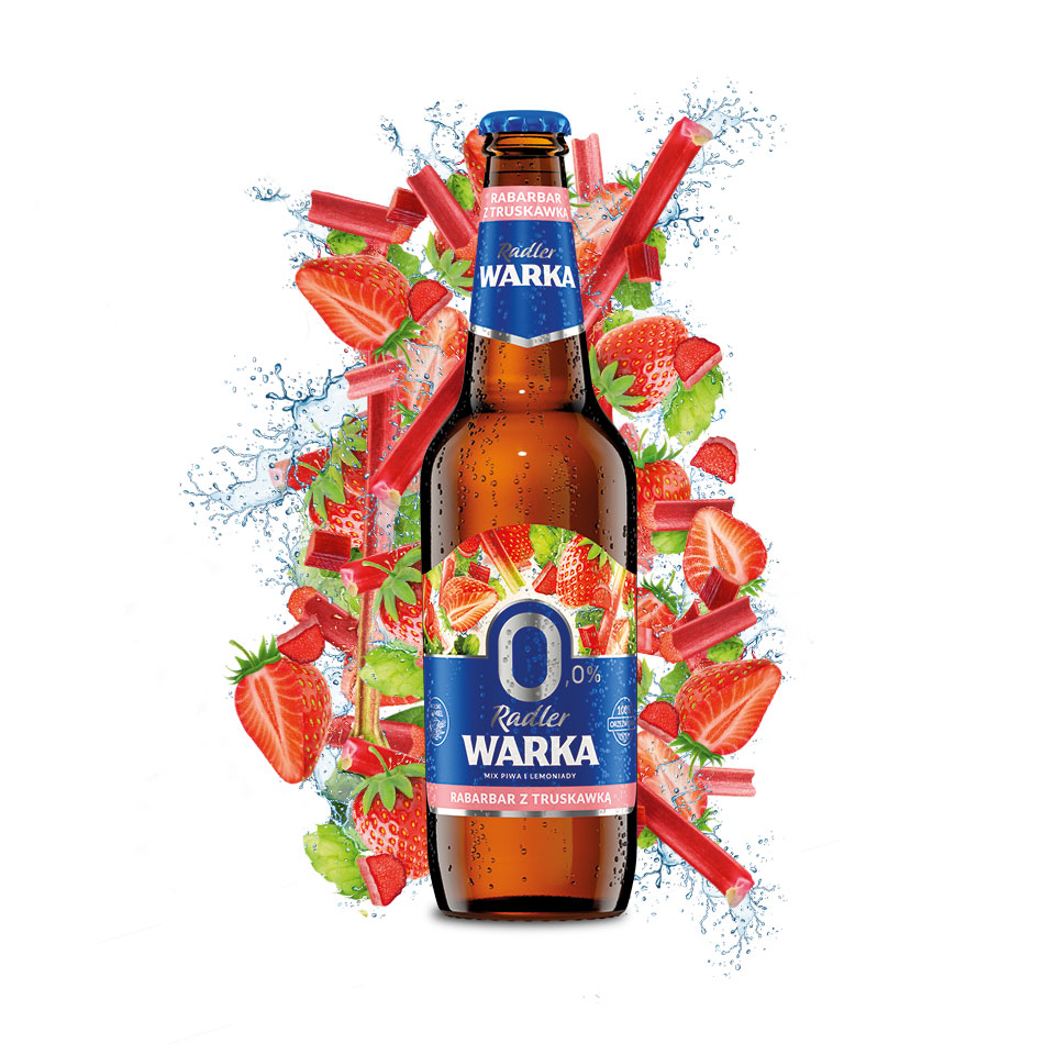
In 2020, Warka focused on a breath of freshness as well as new products in its portfolio. The identification of Warka Radler 0% has been completely changed, moreover, the range of products has expanded with new flavors, including rhubarb-strawberry. The previous Warka percentage has also undergone a significant change – the alcohol content has been increased from 2% to 3.5%, thanks to which Warka 3.5% has been placed more in the beer category than light refreshing lemonade-like beers.
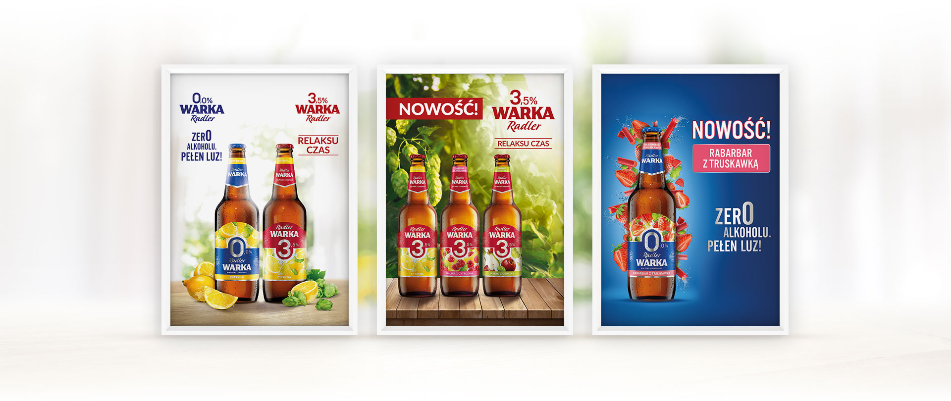
In both cases, our task was to develop Key Visual, which despite one category would be significantly different from each other. The final task turned out to be a challenge, where as part of one Key Visual we supposed to combine two separate categories of beers.
Actions.
Creating Key Visuals is our specialty, that’s why we started working right away.
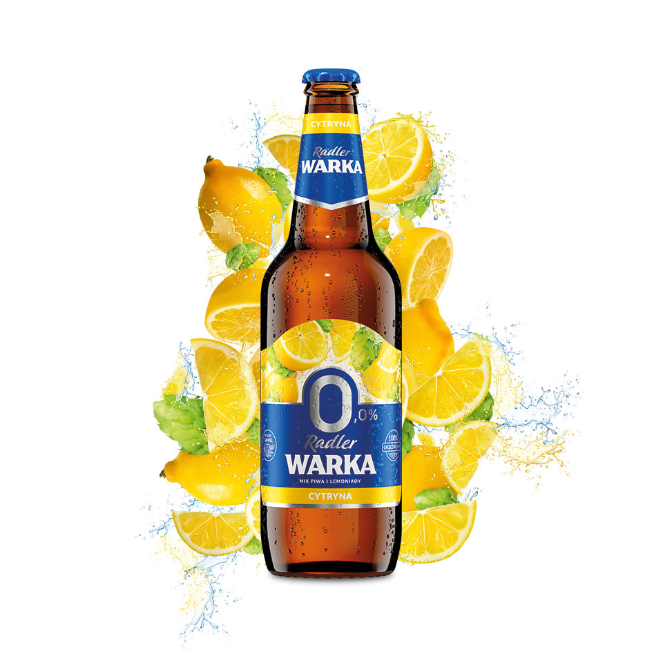
At Warka Radler 0% we focused on the fruitiness offered by flavor variants. This is a key element of our design, thanks to which the consumer immediately pays attention to the product.
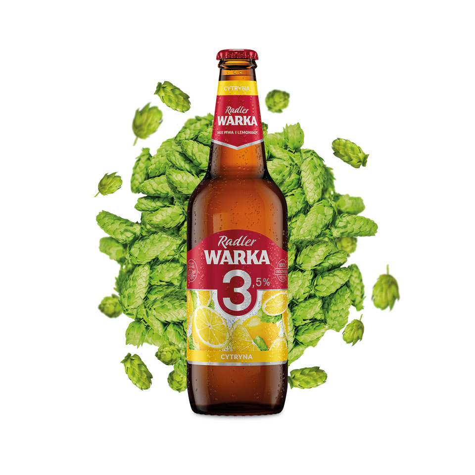
In the case of Warka 3.5% more than fruit we focused on beer. Thanks to this, Key Visual was created, which identifies Warka 3.5% as a flavored beer, which you can relax with. We also managed to combine both Key Visuals into one, neutral, communicating both series of products.
Effect.
Our Key Visuals make Warka 0% and 3.5% stand out from the competition by showing their diversity in the area of fruit beers. They communicate that in this type of beer the consumer has a huge choice, and that choice is always Warka 😉


